Close


Craftsmanship | Campaigns | Collaborations

13 Min Reading
Play Video
Loading
Pause Video


A Place To Discover Oliver Peoples Gio Ponti
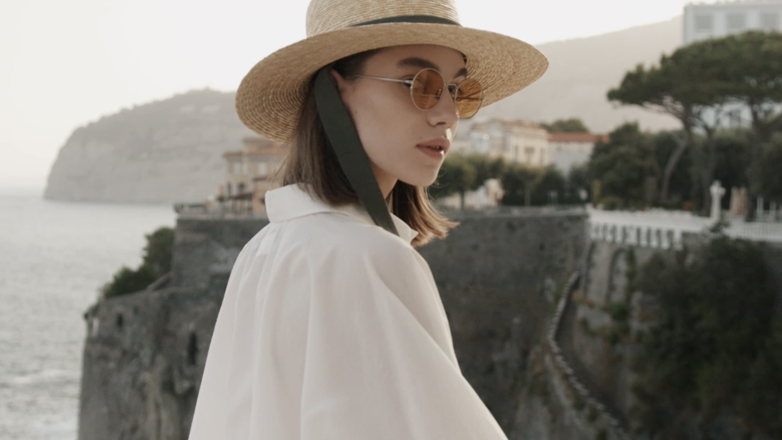
From exteriors to interiors, Hotel Parco dei Principi is an incredible look at the work of Gio Ponti himself, and with this, the ideal place to capture the Oliver Peoples Gio Ponti collaboration campaign.
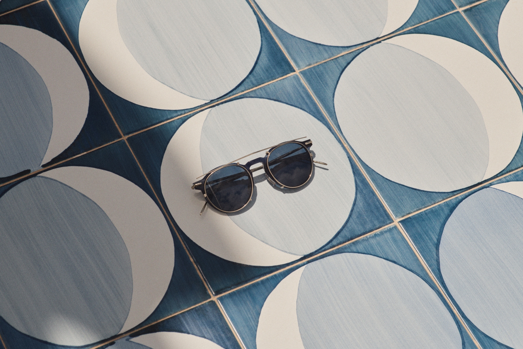
G.Ponti-1, in Blue Tortoise + Soft Gold, blends with the hues of Gio Ponti’s designed tiles for Hotel Parco dei Principi.
Gio Ponti received this felicitous commission from the Neapolitan real estate magnate and entrepreneur Roberto Fernandes in early 1960 at the earliest days of a decade that would bring seismic change. The client brought Ponti to this historical site, not far from Naples, where 18th century villas of the local nobility were scattered on a jutting clifftop. Among these exquisite follies some relatives of the Romanovs acquired a plot and set out to build what they eventually had to call an unfinished 19th century ”medieval revival English castle”. It is on the footprint of this quasi-ruin that the new luxuriant hotel was to rise. ”I was brought there one day when everything was blue through the fog of the solar haze: blue sky, blue sea, blue outlines on the horizon of Capri, Ischia, Procida (blue islands) Posillipo (blue peninsula) and Vesuvius (blue volcano)… Let the building be blue and white outside, and white and blue inside”
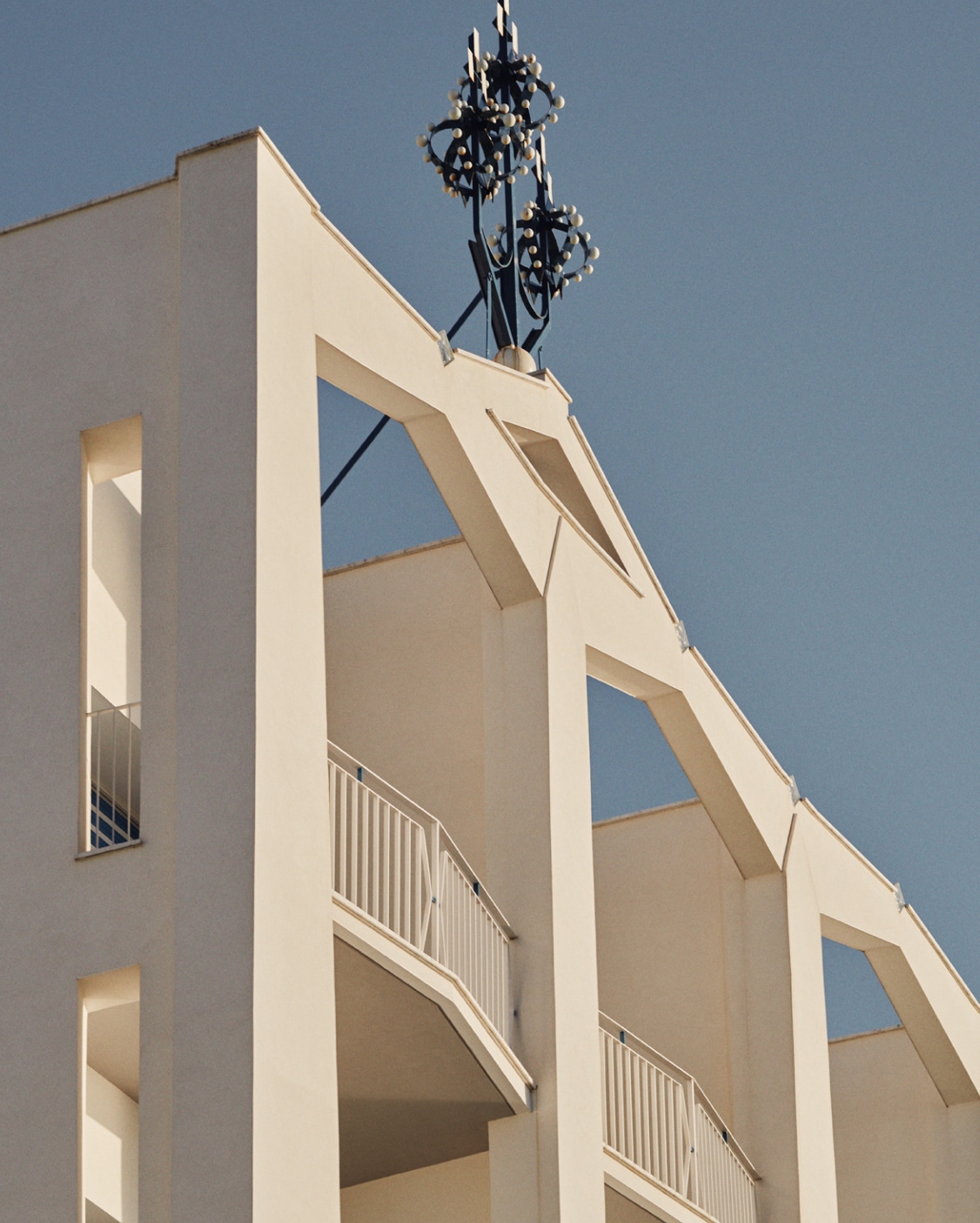
The Hotel features the signature angles of Gio Ponti’s style that inspired the design of the glasses.
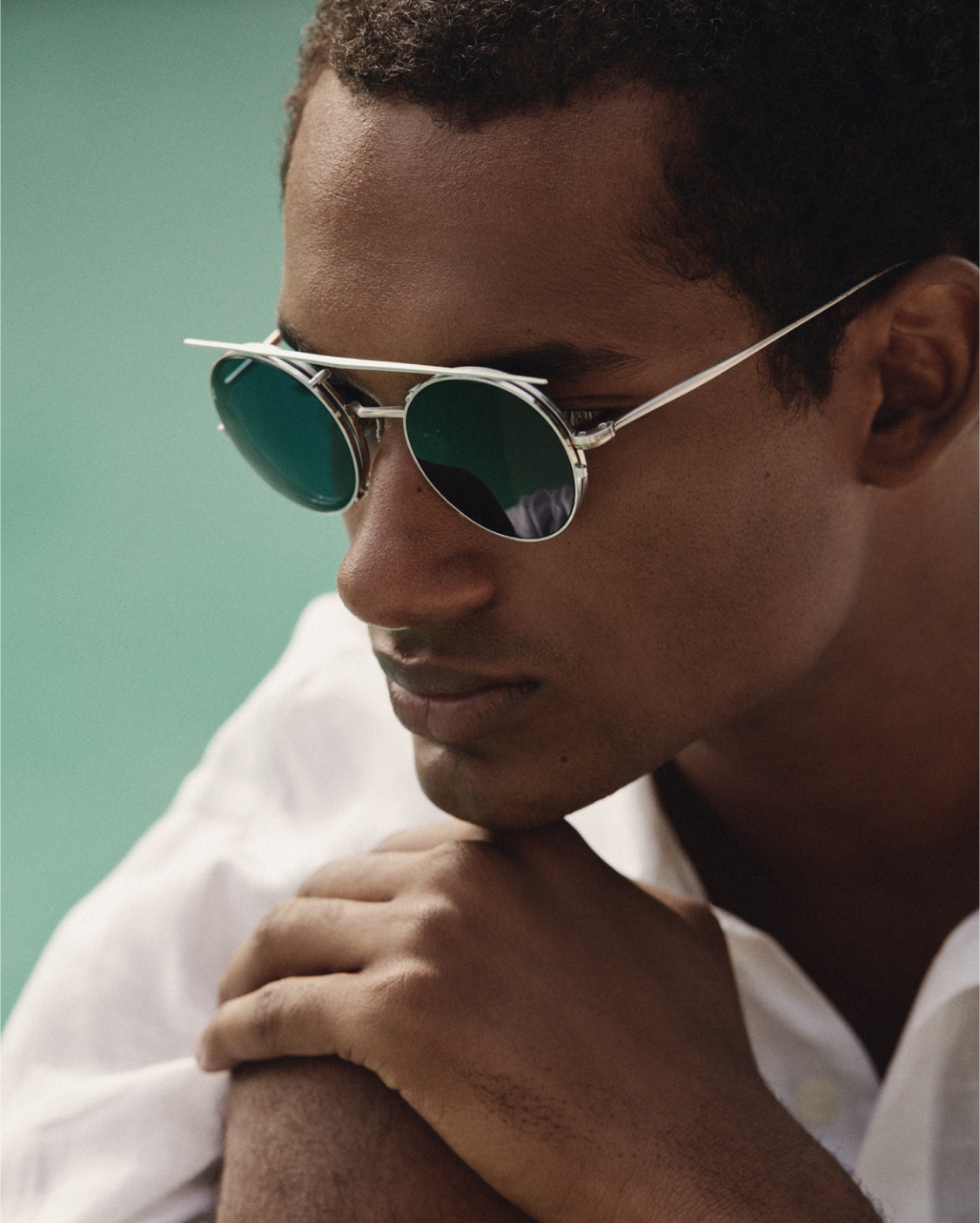
The impactful details of G.Ponti-2 can be seen at every angle of the frame.
Concepts immediately sprung up with a profusion of drawings, sketches, and notes. Ponti resolved to amplify space and budget so that he could delve into extremes. He writes that architects ”must design magic villas for your vacations, and enchanting hotels for your travels”. In the end, he more than delivered what the program called for. It is remarkable that this hotel still stands completely intact with Ponti's humanist vision teeming with multiplicities of bewildering elements. You could not dream of a better place for the launching of the new Gio Ponti collection from Oliver Peoples. This choice is at once bold and prescient. Much like the calling Gio Ponti sensed to this incredible space, Oliver Peoples felt equally inspired to find impact – specifically visiting the hotel for their campaign and exclusive collaboration with the Gio Ponti Archives for Series II collection. The hotel frankly feels like a modern case study – epitomizes all that breathes the work of Ponti – that there was no question Hotel Parco dei Principi needed to be the backdrop of the campaign.
Even in the shade, the vibrant colorway of G.Ponti-3 Brushed Brass + Burgundy stands out.
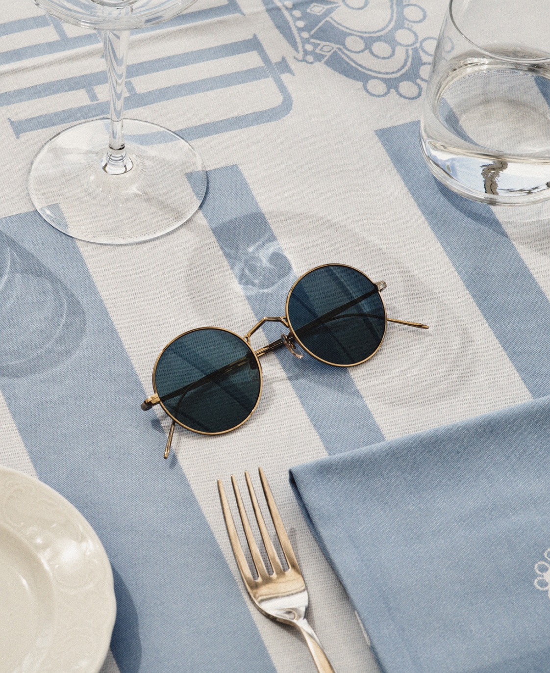
The frequent use of blue can be seen throughout the hotel grounds and in the collaboration colorways.
”I designed a hotel in Sorrento and although there was no need, I wanted each of the 100 rooms to have a different floor. I did this for my love of ceramics. I push myself to do more than what is asked of me. So, with 30 different designs, each allowing for 2,3, or 4 combinations, 100 distinct floors were possible.” This endows each room with a particular theme or narrative. Thus, while the furniture and fittings are nearly identical, you might happen to stay in a ”room of stars”, a ”room of moons”, a ”room of diamonds”, or ellipses, leaves, clovers, etc.


His work stands out for its multifaceted visual impact that is bound to inspire wonder and delight. Vibrant sunshine is a condition which defines and delineates the architecture as it enhances the skin of the building, which is covered in myriad white glazed ceramic pebbles.
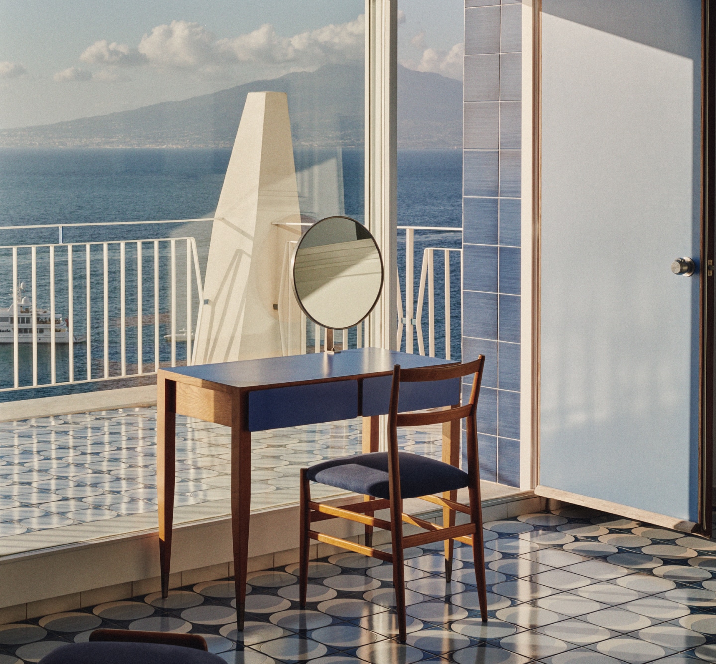
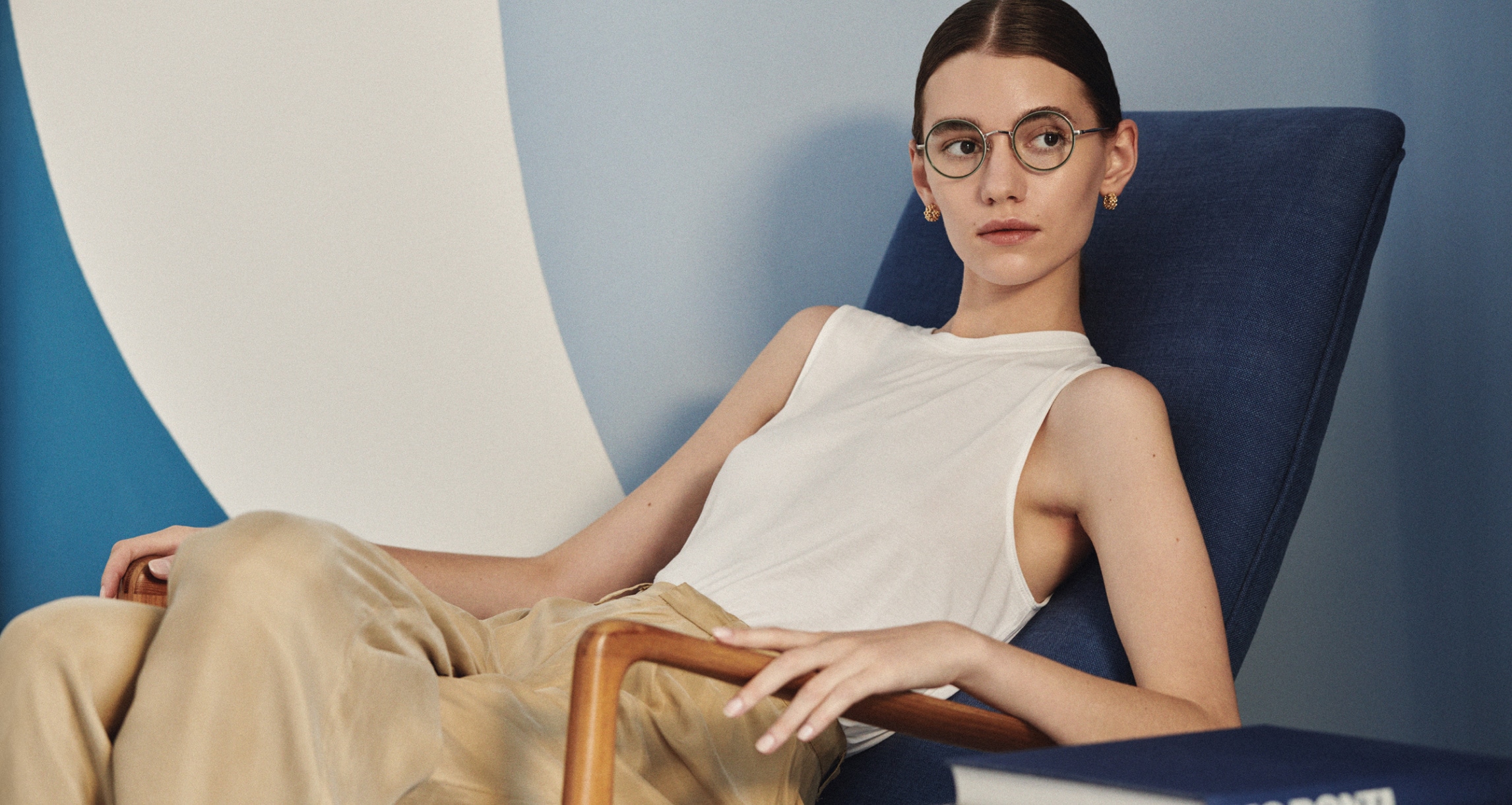
A quintessential Gio Ponti scene, the room is in perfect balance of classic and modern elements that creates a timeless aesthetic, like the design of the collaboration frames.


In the Parco dei Principi hotel guest rooms Ponti reached a peak in the exalted reinterpretation of all his furniture typologies. His designs here were drawn with seemingly effortless sweeping lines, and in the best examples, form was blocked out in two colors with blue and white laminates. Also, when designing this particular bedroom furniture, he could apply the concept of finite form that he had strived to attain in both architecture and design, and it pushed the optical reading towards a compelling crystalline gestalt. These were all experiments in dematerializing interior spaces, starting with furniture innovations (shelves integrated with headboards or cabinets enhanced by hidden light sources) that deliberately avoid overt tectonic display. Many of these forms resurfaced in his architecture right up to 1970s, such as the Denver Art Museum or the Taranto Cathedral.
With its distinctly sharp bridge, G.Ponti-3 finds the perfect balance of angular and rounded design.

The details of the frame are highlighted with the noticeable contrast of Brushed Brass + Burgundy colorway.
The overall structure of the Parco project and its spatial qualities are also the demonstration of an architect’s thinking and methodology whereby Ponti distills his innate sensibilities through his labyrinthine handling of space and tectonics to create a place to rest and wonder. In the lobby, forms clash in abstract configurations that transport the room beyond its material envelope into the lush verdant greenery of the ancillary gardens. To corroborate this effect, Fausto Melotti was entrusted with designing ceramic panels inserted in the hexagonal shaped dividers and perimeter walls. These pictorial elements pull the public lobby and restaurant spaces together in a gentle embrace apt to soothe a weary traveler or casual occupant.

G.Ponti-2 finds common ground alongside G.Ponti-3.
Meanwhile, Ponti also considers those who make it possible to live the dream: “Architecture is an art subject to certain conditions and the client will be one of its authors, if he seeks to understand it and not merely accept it passively“. While these words may reflect the inspired patronage emerging from the dynamic cultural environment of the 60s, Oliver Peoples is now building a bridge to that enlightened period in this campaign. As far as I am concerned, “the past“ does not exist because I consider everything in our culture to be simultaneous.. Neither do I believe in technical “breaks“ between ancient and modern architecture....because neither techniques nor new materials alter the eternal and unique conditions of judgment but on the contrary continue them. No matter how new and different the functions, how new and unlike the expressions…artistic evaluation remains the same; is it still based on unvarying principles?

A classic Oliver Peoples clip-on accessory takes on new life with the sharp lines of the Gio Ponti aesthetic – shown above in G.Ponti-1.

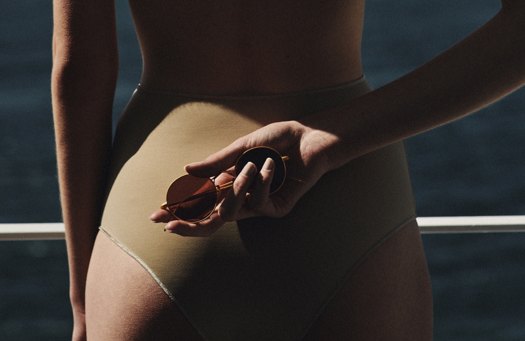
G.Ponti-1 is seen alongside in Tortoise Polished Brass with G-15 clip.
The judgment of a work of art is one and always one: Is it beautiful or not beautiful? Is it art or not? Does it or does it not fascinate us?
Always indexing his creative path to a notion of pan-Italian culture, with his unerring quest for la casa all' italiana, Ponti intentionally and radically dispenses with the domestic interior as machine à habiter. Introducing a new humanist condition in tune with the mid-20th century architecture debate, Ponti confidently cued his perspective to the Renaissance, when architects treated their clients as spectators for whom spatial inventions were being staged for endless divertimenti. One senses a renewed interest in the poetics of the unexpected and the novel overtones thus acquired when bold wit is bathed in harmony. All of this reveals Ponti with a penchant for a ludic condition, and one that finds Oliver Peoples campaign and their product delightfully aligned.
Even without the clip, G.Ponti-2 is just as noticeably distinct. Interesting fact: the chair shown above is one of the few pieces of furniture not designed by Gio Ponti but selected by him for the Hotel. This armchair was designed by Norwegian designers, Rolf Rastad & Adolf Relling, for Arnestad Bruck, and the rights were acquired by Cassina in 1961, calling this model “Poltrona 829.”
The hotel is an incredible opportunity to truly breathe life from ceiling to floor of all that Ponti envisioned. It’s a place that impactfully inspired the design team at Oliver Peoples. From the frequent use of blue, to polished brass detail, to dominant angular lines throughout the property, every detail feels quintessentially Ponti, and in turn, each of the details found purpose in every element of the new Oliver Peoples Gio Ponti collaboration.
WORDS: Brian Kish
Video and pictures: Rich Stapleton